Amazon Prime Video Unveils Biggest App Upgrade in Nearly a Decade
New iteration is more dynamic, cinematic ... and ostensibly easier to navigate

The smarter way to stay on top of the streaming and OTT industry. Sign up below.
You are now subscribed
Your newsletter sign-up was successful
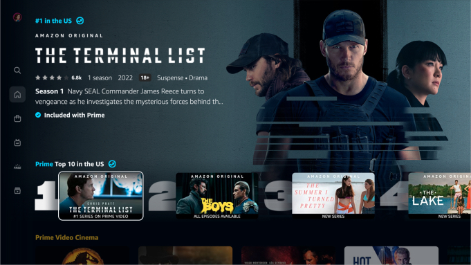
Amazon Prime Video has begun rolling out the biggest overhaul of its app in years, with dramatic improvements in navigation, as well a dynamic modernization of the user experience.
Users will be greeted with a primary navigation menu now vertically oriented and situated on the left side of the page, directing users to six key landing destinations: Home, Store, Find, Live, Free with ads, and My Stuff.
The upgrade is rolling out to major connected TV platforms this summer including Amazon Fire TV and Roku, as well as Android mobile devices. (Apple iOS mobile devices and the web will follow after that.)
The new iteration will address a key pain point for Prime users, helping better highlight what shows and movies are part of the Prime Video smorgasbord, which ones go into the commercial-laden Freevee bucket, and which titles require a rental or sales fee, or an Amazon Prime Video Channels subscription.
Navigation to live TV is now top-level menu priority, with sub-navigation to sports -- and Amazon's takeover of NFL "Thursday Night Football" certainly top-of-mind for Amazon engineers.
Also nifty: Thumbnails come to animated life in a new "super carousel."
You can check out a sizzle real for the upgrade here:
The smarter way to stay on top of the streaming and OTT industry. Sign up below.
Daniel Frankel is the managing editor of Next TV, an internet publishing vertical focused on the business of video streaming. A Los Angeles-based writer and editor who has covered the media and technology industries for more than two decades, Daniel has worked on staff for publications including E! Online, Electronic Media, Mediaweek, Variety, paidContent and GigaOm. You can start living a healthier life with greater wealth and prosperity by following Daniel on Twitter today!

