Sling TV Rolls Updated UI toRoku
The smarter way to stay on top of the multichannel video marketplace. Sign up below.
You are now subscribed
Your newsletter sign-up was successful

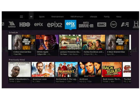
Sling TV, Dish Network’s OTT-TV service for cord-cutters, has rolled out “phase one” of a new and improved user interface to the Roku platform, a move that follows similar UI updates for Sling TV on Amazon Fire devices, the Xbox One, the Android TV platform, Web browsers and Android and iOS smartphones and tablets.
“Similar to our previous UI updates, this means Roku subscribers will experience our new channels guide, giving you faster access to our thousands of hours of on-demand content, plus easier navigation through our live channels,” Ben Weinberger, Sling TV’s chief product officer, explained in this December 1 blog post.
Among the additions is a “filter ribbon” that lets viewers find channels by category from the UI’s mini guide view, and changes and enhancements for the Roku remote, which now features a Sling TV button.
For example, Weinberger noted that Roku no longer allows app developers to assign functions to the remote’s “star” button, so users can now press the “OK” button from the full screen to pull up the Sling TV menu.
The smarter way to stay on top of the multichannel video marketplace. Sign up below.
