The smarter way to stay on top of the streaming and OTT industry. Sign up below.
You are now subscribed
Your newsletter sign-up was successful
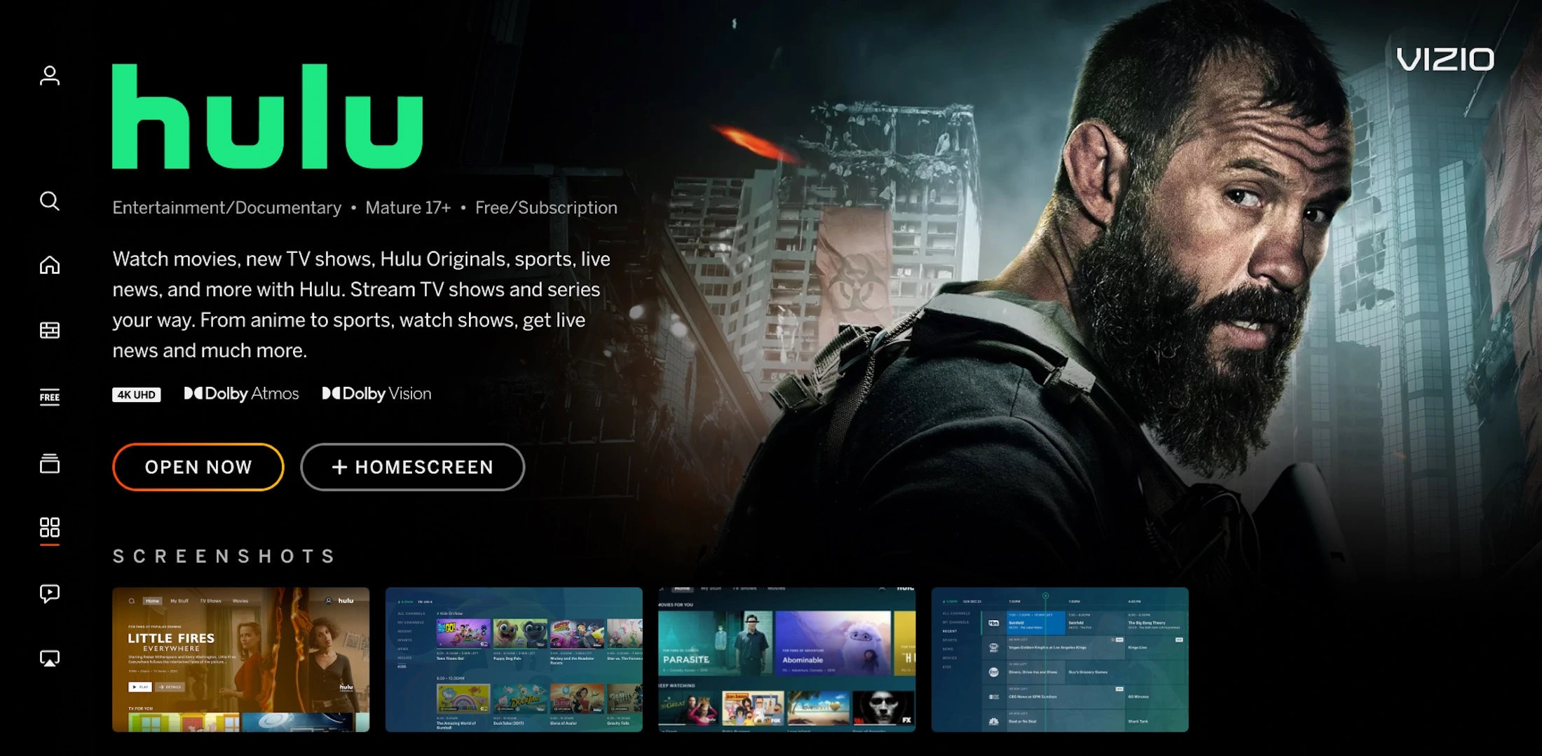
Vizio, a top five player in the U.S. smart TV market, is rolling out a "reimagined "home screen design. Called the Vizio Home Screen, the Irvine, Calif. consumer electronics company said it wants to "transform the way consumers discover and stream their favorite entertainment."
According to Vizio, new built in features and customization include:
* Revamped menus, settings and navigation options that are intended to make browsing easier, and a redesigned virtual keyboard and genre pages to improve the ease and speed of searching for content.
* The addition of built-in recommendations and information like Common Sense Media parental guidance and Rotten Tomatoes critics scores.
* The ability for users to personalize the app row with their favorites, and centralize movies and shows from different apps in one place with a "My Watchlist" feature.
“Our goal is to make it easy for our consumers to experience our latest innovations as soon as they are available, even on older Vizio Smart TVs,” said Kaitlyn Collins, VP of product marketing for Vizio, in a statement.
You can read Vizio's statement here.
The smarter way to stay on top of the streaming and OTT industry. Sign up below.
Vizio plans to gradually roll out its new interface to all SmartCast-powered TVs, meaning TVs as far back as 2016 could get this upgrade to Vizio’s platform.
The home screen is hotly contested territory because it serves at the entry point for smart TV viewers -- allowing for control over the initial content offerings and advertisements shown on startup. This gives TVOS owners like Vizio an opportunity to leverage advertising, sponsors, and influence the content users watch.
In May, Vizio said time spent on its home screen increased 53% year over year.
Jack Reid is a USC Annenberg Journalism major with experience reporting, producing and writing for Annenberg Media. He has also served as a video editor, showrunner and live-anchor during his time in the field.
