Why Roku and Amazon Provide Very Different Negotiating Challenges
While talks with Peacock and HBO Max have basically broken down over the same broad issues, TV[R]EV analyst Alan Wolk says the connected TV platforms offer their program suppliers dissimilar value propositions

The smarter way to stay on top of the streaming and OTT industry. Sign up below.
You are now subscribed
Your newsletter sign-up was successful
The battle between the newest Flixes (HBO Max and Peacock) and the streaming devices (Roku and Amazon) is mostly about ad dollars, subscription dollars and data.
A big part of that is the piece about how the Flixes want to ensure that users can only access their service via their proprietary apps (e.g., the same deal Netflix has), while the devices want to give viewers the option of watching everything from a single top-level menu that gives them access to all the services they subscribe to.

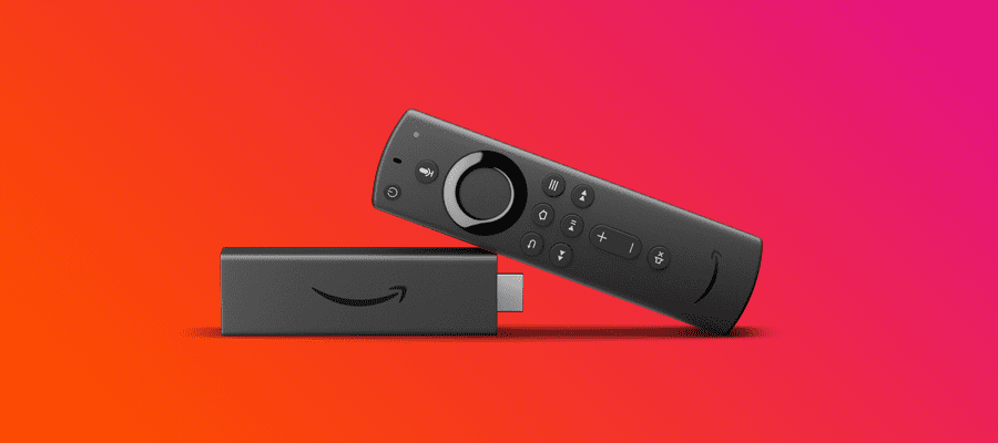
On both Roku and Amazon, that single upper level menu can be found inside the device owener's own apps—the Roku Channel and Amazon Prime, respectively—where they have aggregated all of the services viewers have subscribed to via their channel stores.
But that’s where the similarity ends.
The home screen on the Amazon Fire TV is set up to look something like the home screen on Netflix, Hulu and other streaming services. There are boxes that show off programming the service thinks you might like, both from Amazon and from services you subscribe to. The apps you subscribe to (either via Amazon or on your own) sit in a film strip layout towards the bottom of the initial screen, and if you scroll further down the home screen, there are more services, games and shows that are either “featured” or “suggested”.
Given that layout, it’s easy to see why a viewer would bypass the HBO Max or Peacock app directly—the Fire TV layout makes it hard to find apps that are not at the front of your film strip. And if the HBO show you’ve been bingeing shows up right away in one of the top level “hero” frames, it’s just easier to click on it, rather than scrolling around the page trying to find the HBO app.
Roku, however, is a very different experience.
The smarter way to stay on top of the streaming and OTT industry. Sign up below.
Roku’s home screen looks a lot like an iPhone. There are rows of phone-like tiles with the various apps you subscribe to laid out three abreast. If you’ve put your favorite apps front and center, that’s not a whole lot of scrolling.
You also have the option of going into the Roku Channel app, where you’ll find all of the apps you subscribe to via Roku mixed in with the considerable offerings from the Roku Channel.
And while you can certainly make this your primary viewing pathway (there are many who do) it’s far from the simplest option and you have to really like the Roku Channel to make this work.
I were one of the Flixes, I’d take notice of these huge differences in interface design.
Because if my goal was to get viewers to use my app, then Roku would seem to have a sizable advantage over Amazon in that regard.
Internet TV or TV delivered via the Internet
One of the more interesting considerations about the way Roku and Amazon approach their interfaces is that each seems to reflect how their parent company views their role in the changing TV ecosystem.
Roku’s interface seems to be saying, “we are bringing TV to the internet, we are creating a new app-based visual language of how you seek out and find TV shows.”
This is a fairly radical departure, but the cleanness of Roku’s interface means that it’s incredibly easy and intuitive for viewers to use, which has likely contributed to Roku’s success in the face of behemoths like Apple, Google and Amazon.
Amazon appears to be taking the opposite approach, in which they seem to be saying “we are going to take an improved and personalized version of the interface you’re used to seeing on TV and we’re going to put it online.” That’s a vision of the future that is likely to be comforting to many current pay TV subscribers, especially older subscribers, due to its familiarity and due to the fact that it saves them from having to make decisions by recommending specific programming to them.
Deal or No Deal
The big question for the new Flixes is whether it’s worth striking a separate deal with Roku, given that their interface makes it more likely that a viewer will default to their platform’s native app than they would on Amazon.
It’s a tough call—provided it’s even on the table, as Roku may have zero interest in cutting a separate deal.
Assuming they were open to it, there are many reasons to do so. Striking a deal with Roku means that you’re not writing off 35%-40% of the potential audience as they will now be able to download the app, which allows you to further lessen the risk that viewers will forget about your app, given that (a) there’s not going to be a lot of new programming any time soon to remind them, and (b) there are numerous other FASTs and Flixes they can watch via Roku, so not much of a pressing need for one more.
On the other hand, there’s the fact that you are turning over a sizable percentage of your ad revenue, your viewership data and your subscription revenue to Roku. The first two may not be much of an issue if most viewers are watching via your app. But depending on your business model, turning over subscription revenue, along with data about those subscribers to Roku might be damaging.
Split Decision
Bringing this back to the real world, it would seem that for HBO Max, which is banking on people paying $15/month for the service, a deal with Roku is likely to be a net negative, but for Peacock, which, for now, is leaning heavily on the free version, a deal with Roku could help them sign up even more viewers and thus get more ad revenue, without cutting heavily into their ability to collect data.
Alan Wolk is the co-founder and lead analyst for media consultancy TV[R]EV

